My Blog
Practical Logo Design with an Online Editor

By Samir Holt
A useful logo identifies a business clearly wherever customers encounter it. It should remain recognisable in a website header, a small profile image, a pr
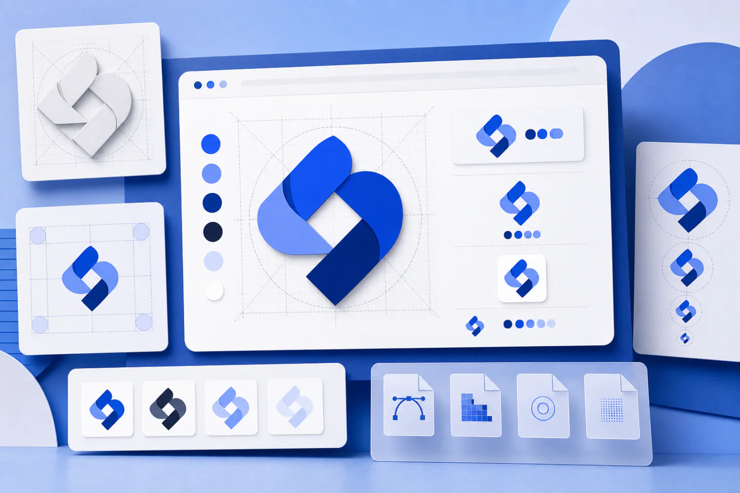
A useful logo identifies a business clearly wherever customers encounter it. It should remain recognisable in a website header, a small profile image, a printed label and a one-colour document. An online design editor can make the drawing process accessible, but the quality of the result still depends on the decisions made before and during editing.
Start by defining the job of the mark, then build the simplest form that can do that job. Test it in realistic settings, prepare several purposeful versions and record the rules needed to use it consistently.
Define the brief before designing
Write a short brief before opening a template. State the business name exactly as it should appear, the audience, the main use cases and three qualities the identity should convey. Words such as calm, practical and direct are more useful than a vague request to make the design attractive.
List the places where the logo will appear. A mark used mainly on small product labels has different needs from one displayed on vehicles or wide website headers. Note any fixed constraints, including long names, required wording, single-colour printing or backgrounds that cannot change.
Collect visual references to discuss principles rather than to copy. Identify useful characteristics such as generous spacing, compact lettering or a simple silhouette. Check nearby competitors too. This helps reveal common category conventions and overused symbols that could make a new mark difficult to distinguish.
Choose an appropriate logo structure
A wordmark uses the business name as the main visual element. It suits a short or distinctive name and keeps recognition tied to readable text. A lettermark uses initials when the full name is too long for small spaces. Both depend heavily on careful type, spacing and proportions.
A combination mark pairs a name with a symbol. It is flexible because the full version can introduce the identity while the symbol can support compact uses later. An emblem contains type within a badge or shape. Emblems can feel established, but fine details and curved lettering often become unclear when reduced.
Choose the structure that works for the brief, not the most decorative template. A new identity usually benefits from keeping the full name visible. A symbol should not be expected to identify an unfamiliar business on its own.
Build a clear first concept
Start with typography
Set the business name before adding graphics. Try a small number of type directions and compare them using the same wording, size and colour. Look for clear letterforms, balanced spacing and a shape that remains readable when reduced. Decorative scripts, very thin strokes and tightly compressed letters need particular care.
One type family is often enough. If a tagline is essential, use a simpler supporting style and give it enough size and contrast to remain legible. Remove it from compact versions if it becomes too small. Do not stretch type to fit a space; change the size, tracking or layout instead.
Use colour with restraint
Begin in black and white. This exposes weak shapes and poor hierarchy without allowing colour to hide them. Once the structure works, add a limited palette with one dominant colour and a neutral or contrasting partner. Add an accent only when it has a defined role.
Test the palette on both light and dark backgrounds. Similar tones may merge, while bright combinations can make small text uncomfortable to read. Colour should support recognition, but the mark must not depend on colour alone. A one-colour version is necessary for stamps, embroidery, basic printing and other restricted uses.
Keep symbols specific and simple
A symbol should express one relevant idea rather than illustrate every service. Look for a distinctive detail in the name, process, location or product shape. Reduce that idea to a clear outline. Generic leaves, globes, light bulbs and arbitrary swooshes rarely become distinctive without a thoughtful treatment.
Use shapes to organise the mark, not to fill empty space. Adjust the size and position of the symbol until it supports the name rather than competing with it. If the concept needs gradients, shadows and tiny internal lines to make sense, simplify the underlying shape.
Adapt templates instead of accepting them
A template is a starting layout, not a finished identity. Replace sample wording, type, colours and graphics. Change proportions and spacing so the composition responds to the actual name. Two businesses can choose the same starting design, so superficial edits may leave a mark looking generic.
Keep each concept on a separate page or duplicate the file before major changes. Name versions clearly so an earlier direction can be recovered. Compare a few genuinely different concepts rather than producing many minor variations of one idea.
Before approving any stock element, review its licence for the intended use. Do not assume access to an element gives exclusive ownership of it. Where distinctiveness or registration matters, consider original artwork and obtain qualified advice about rights and clearance.
Refine spacing and hierarchy
Good balance is visual rather than mathematical. A dense symbol may need to appear smaller than a light wordmark even when their measured dimensions match. Inspect the space inside the design as well as the clear space around it. Crowded elements make the mark harder to recognise and awkward to place.
Review these details before export:
- Alignment: edges, centres and baselines should relate deliberately.
- Spacing: gaps between the symbol, name and tagline should feel consistent.
- Hierarchy: the business name should remain the clearest essential information.
- Contrast: every required element should remain distinct from its background.
- Silhouette: the overall shape should be recognisable without fine detail.
Step away from the screen, view the design at its intended size and ask another person to read the name without prompting. Familiarity can make the designer overlook unclear letters, accidental shapes and uneven spacing.
Test the logo in real situations
Do not approve a logo only at full-screen size. Place it in rough examples of a website header, a square profile image, a narrow label and a simple document. Use the backgrounds likely to appear in practice. These tests reveal whether a wide lock-up, small tagline or delicate symbol creates problems.
Reduce the mark until it reaches the smallest expected use. If the name becomes unreadable, remove supporting text, increase letter spacing or create a compact version. If the symbol becomes a blur, remove internal detail or strengthen important strokes. Enlarging a weak design does not solve these issues at smaller sizes.
Check the design in one colour, reversed in white on a dark background and printed on an ordinary office printer. Also inspect it on a phone rather than relying on the editor preview. A robust identity should survive modest production conditions, not only an ideal display.
Create a practical logo set
One file cannot serve every placement well. Prepare a small family of approved versions that share the same type, proportions and visual idea:
- Primary lock-up: the complete logo for general use.
- Horizontal version: a wide arrangement for headers and signatures.
- Stacked version: a compact arrangement for narrow or square spaces.
- Symbol or initials: a simplified mark for very small placements.
- One-colour and reverse versions: controlled options for limited backgrounds and production methods.
Preserve an editable master and export copies from it. Use a transparent raster file for common digital placement, a vector file where scalable artwork is required and a print-ready file prepared to the printer's specification. Do not enlarge a small raster export for signage or packaging, because it may lose sharpness.
Use clear filenames that include the version, colour treatment and file type. Keep obsolete drafts separate from approved files so nobody selects an unfinished mark by mistake.
Document consistent use
A one-page guide is enough for many small organisations. Show every approved version and record exact colour values, type choices, minimum size and required clear space. Include examples of unsuitable changes, such as stretching the mark, recolouring individual parts, adding effects or placing it on a low-contrast image.
Store the guide, editable master and exports in one controlled location. Give collaborators templates sized for common channels rather than asking them to rebuild layouts. Before publishing, check the file version, proportions, background contrast and surrounding space.
Useful interface references include:
- Canva logo design process
- Canva brand assets
- Canva Brand Kit
Final review checklist
- Confirm that the name is correct and immediately readable.
- Check that the design reflects the written brief rather than a passing style.
- Test the smallest, largest, one-colour and reversed uses.
- Review element licences and any necessary rights clearance.
- Export the approved logo set and archive the editable master.
- Record simple usage rules and share only current files.
A finished logo is not the version with the most detail. It is the version that identifies the organisation clearly, adapts to its real applications and can be used consistently by everyone responsible for the brand.