My Blog
Chevron Logo: A Practical Guide to Meaning, Use and Design

By Samir Holt
A chevron logo uses two angled arms meeting at a point. The practical design challenge is making that simple form distinctive, legible and suitable for its
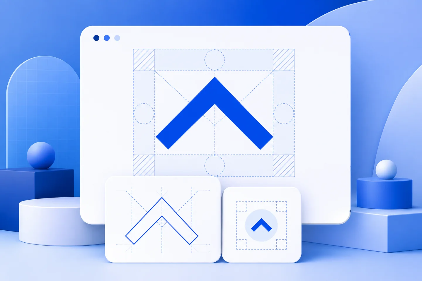
A chevron logo uses two angled arms meeting at a point. The practical design challenge is making that simple form distinctive, legible and suitable for its intended setting. Start with its purpose, then work through geometry, typography, file preparation and placement.
In design language, a chevron is a V-shaped or inverted-V-shaped form. The word has also been used for architectural patterns, heraldic devices and uniform badges for centuries. Merriam-Webster defines a chevron as a figure, pattern or object shaped like a V or an inverted V, while the historical Encyclopædia Britannica entry on chevrons describes related uses in architecture and heraldry.
What does a chevron logo communicate?
The basic chevron is simple: two angled strokes meet at a point. That simplicity gives it considerable flexibility. Pointing upward, it can suggest direction, progress, elevation or a roof-like structure. Pointing downward, it may indicate a fold, a descending movement or a visual divider. Several chevrons can create rhythm, stripes, depth or a repeating pattern.
Those associations are possibilities, not fixed meanings. A chevron does not guarantee that a business will appear modern, energetic or trustworthy. Its effect depends on the angle, weight, spacing, colour, surrounding typography and the category in which it appears. A narrow, sharp mark may feel technical. A broad, rounded form may feel softer. A repeated pattern may become decorative rather than recognisable as a brand symbol.
Begin with the job the mark must perform. Is it meant to identify a company at a glance, guide a visitor through an interface, distinguish a product line or provide a background pattern? A symbol used as a navigation cue has a different responsibility from a registered brand identity. Confusing those roles often produces a logo that looks attractive in a presentation but becomes unclear at small sizes.
Start with the intended use
Write a short brief before choosing a chevron logo. Record the organisation’s exact name, the audience, the main applications and the qualities the identity should express. Include practical constraints such as a long business name, one-colour printing, dark backgrounds, embroidery, small digital icons or a narrow website header.
Then decide whether the chevron is the primary symbol or a supporting device. A business with an unfamiliar name may need the wordmark to remain prominent. A chevron can sit beside the name, above it or within a larger shape, but it should not compete with the information that tells people who the organisation is.
Consider whether the direction has a reason. An upward point may support a theme of movement, but it can also look generic if every competitor in the category uses the same visual language. If the chevron is only decorative, treat it as a pattern or layout element rather than forcing it to carry the full burden of identification.
Build a distinctive chevron form
The most basic chevron is easy to reproduce, which is both its strength and its weakness. A plain V may be clean and useful, but it can also be difficult to distinguish from other marks. Distinctiveness can come from proportion, spacing, line endings, a controlled relationship with the wordmark or a meaningful structural detail.
Test several directions rather than making small colour changes to one concept. Compare a single chevron with a paired form, a filled shape with an outline and a compact symbol with a wider wordmark lock-up. Keep the alternatives genuinely different while preserving a clear connection to the written brief.
Use restraint. A symbol that needs multiple outlines, shadows, gradients and internal details to appear finished may not survive reduction. Start in black and white so the geometry can be judged without colour doing the work. Add colour only after the shape, hierarchy and spacing are working.
Pay attention to the point of the V. A very sharp point can create an aggressive impression or become fragile in small reproduction. A blunt point may feel stable but lose the recognisable character of the form. The angle of the arms should relate to the rest of the identity, especially if the logo is paired with italic type, diagonal photography or directional interface elements.
Use authorised artwork when the mark already exists
If you are using an existing corporate or product logo, obtain the artwork from the rights holder or an authorised brand resource. Do not rely on an image-search preview, a screenshot, a social-media avatar or a third-party logo library as the production master. Such files may be outdated, compressed, recoloured or altered.
Accompanying guidance may define approved versions, clear space, minimum reproduction size, colour treatment and placement. Keep those instructions with the artwork so anyone preparing an export can check the intended proportions and spacing.
Save the original file separately from working exports. Record the source, date and applicable instructions. If the planned use is not covered, pause rather than inventing an approval statement. A logo file is not proof of permission, ownership or affiliation.
Choose the right file and preserve the geometry
Use vector artwork when the logo must work across responsive screens, signage, packaging or other sizes. SVG or another suitable vector format preserves the shape when scaled, provided the file is prepared correctly. A transparent PNG can work for ordinary digital placement when its pixel dimensions match the final use. Avoid enlarging a small raster image, because the edges may become soft and the point may lose definition.
Keep the original aspect ratio. Resize proportionally and avoid stretching the arms of the chevron to fit a banner. Do not crop a complete logo into an improvised symbol unless the rights holder has supplied that version. If a compact mark is needed, create or obtain an approved compact lock-up rather than removing the wordmark without review.
Prepare the colour versions that the real applications require: a full-colour version where appropriate, a one-colour version for restricted production and a reversed version for dark backgrounds if permitted. Never recolour an existing corporate mark simply to match a campaign palette.
Protect clear space and contrast
Clear space is the empty area around a logo. It keeps nearby headings, borders, images and other marks from appearing attached to it. Follow the rights holder’s measurement when one exists. For an original chevron logo without a formal guide, establish a repeatable margin based on a visible part of the mark and apply it consistently.
Review the background around the entire form. A chevron placed over a busy photograph may disappear at its point or merge with a diagonal object. Move it to a quieter area, use an approved solid field or choose another version. Do not add an unplanned outline or glow merely to rescue a weak placement.
Test the logo at the smallest expected size on an ordinary screen and, where relevant, in print. Inspect the point, the internal gap between paired chevrons and any small lettering. If the mark becomes a dark block or an indistinct line, simplify it, enlarge it or create a properly designed compact version.
Make a digital chevron logo accessible
A logo can be decorative, informative or functional. If it is only visual decoration beside an already labelled heading, it may not need to be announced separately. If it is the only content of a link, its alternative text should describe the destination or action rather than merely saying “chevron logo.”
The W3C Web Accessibility Initiative explains that functional images need text alternatives describing their purpose. For a chevron mark, a linked logo might be labelled with the company name and destination, while a decorative copy of the mark can use an empty alternative.
Check keyboard focus, link behaviour and the accessible name in the finished page. Do not hide the destination behind an unexplained icon. If the chevron is part of a larger text link, avoid announcing the same information twice. The final implementation should remain understandable when images are unavailable and when the visitor navigates without a pointer.
Review the finished chevron logo
- Confirm whether the project needs an original chevron or supplied artwork.
- Define the logo’s purpose, audience and real production environments.
- Compare the silhouette and typography with other identities in the same field.
- Use authorised artwork and retain the accompanying usage guidance.
- Test proportions, clear space, contrast and legibility at final sizes.
- Prepare only the file versions that the approved use requires.
- Check link purpose, alternative text and keyboard access on digital pages.
- Record the final files, source and any permission or review attached to them.